

Why Menu Layout Is More Than Aesthetic
When a guest slides a menu across the table, the first impression isn’t just about the photography or the glossy paper; it’s a silent negotiation of expectations, brand personality, and perceived value. A thoughtfully structured menu layout guides the eye, creates a rhythm that mirrors the dining journey, and subtly influences the order in which items are considered, often without the diner realizing it. By aligning visual hierarchy with the restaurant’s culinary narrative, owners turn a simple piece of paper—or a digital screen—into a strategic asset that can boost check averages and reinforce brand identity.
The Psychology Behind Price Presentation
Numbers have an uncanny power to shape perception, and the way prices are displayed can either invite curiosity or create hesitation. Research shows that omitting currency symbols, using whole numbers instead of decimals, and placing higher‑priced items in the middle of a section can nudge diners toward premium choices without overt pressure. Moreover, the spacing between the dish name and its cost, as well as the font weight, subtly signals importance, allowing a well‑designed price column to act as a quiet sales catalyst.
Decoding Portion Sizing for Perceived Value
Portion size is a silent storyteller, communicating generosity, craftsmanship, and the restaurant’s positioning in the market. When a dish is presented with a visually balanced plate—neither too sparse nor overwhelming—it reassures guests that they are receiving a fair exchange for their money, enhancing satisfaction and encouraging repeat visits. Strategic portion engineering, such as offering a modest starter alongside a substantial main, creates a psychological anchor that makes the latter feel more indulgent and worth the price.
Color Theory and Typography in Menu Design
Colors evoke emotions, and the palette chosen for a menu can either amplify or dampen a diner’s appetite. Warm hues like deep reds and oranges are known to stimulate hunger, while cool blues can soothe and suggest refinement; pairing these tones with legible, well‑spaced typography ensures that the menu not only looks appealing but also reads effortlessly. Selecting a font hierarchy that differentiates categories—bold for headings, regular for descriptions—creates visual cues that streamline decision‑making and reinforce the restaurant’s tone.
Strategic Placement of High‑Margin Items
Positioning high‑margin dishes where the eye naturally lands—typically the top right corner or the center of a column—leverages natural scanning patterns to increase their visibility without appearing pushy. By surrounding these profit drivers with complementary items, such as a well‑crafted appetizer or a signature side, diners are subtly guided toward a fuller, more lucrative plate. This layout tactic, combined with evocative language, turns a menu into a profit‑optimizing map rather than a static list.
Leveraging Descriptive Language Without Overpromising
Words are the bridge between a dish’s concept and the palate, but they must walk a fine line between allure and authenticity. Using sensory verbs like “crackle,” “glaze,” or “infuse” paints a vivid picture, while concrete details—origin of the herb, cooking technique, or texture contrast—anchor expectations in reality. Overly grandiose claims risk disappointment; instead, concise, honest descriptions foster trust, encouraging guests to explore beyond their comfort zone while feeling confident in their choice.
Digital Menus vs. Print: A Comparative Look
Digital menus offer dynamic flexibility—prices can be updated instantly, high‑margin items can be rotated based on inventory, and interactive elements like photos or allergen filters enhance accessibility. However, the tactile experience of a well‑crafted print menu still carries a sense of ceremony that many diners associate with quality and tradition. Balancing both formats, perhaps by providing QR‑linked extensions to a printed core, allows restaurants to harness the strengths of each medium while catering to varied guest preferences.
Testing and Iterating: Data‑Driven Menu Tweaks
Just as kitchens experiment with flavor, the front‑of‑house should treat the menu as a living document, regularly testing variations to uncover what truly resonates with patrons. By tracking order frequency, average check size, and guest feedback, managers can identify underperforming items and adjust descriptions, placement, or pricing accordingly. Integrating insights from AI‑Powered Personalization: How Restaurants Tailor Menus to Every Palate can further refine these experiments, turning raw data into actionable design decisions that continually elevate the dining experience.
Building Brand Loyalty Through Consistent Menu Experience
A menu that consistently reflects the restaurant’s ethos—whether it’s playful, sophisticated, or community‑focused—reinforces brand recall and deepens emotional connections with guests. When the visual language, descriptive tone, and price architecture align across locations and seasonal updates, patrons develop a reliable mental model of what to expect, fostering trust and encouraging word‑of‑mouth referrals. In the long run, this coherence turns a simple menu into a brand ambassador that subtly drives loyalty, repeat business, and a stronger market position.

Becky Putman is an Ottawa-based freelance writer and marketing professional with a passion for storytelling, animals, and community involvement. She enjoys creating engaging content that informs, inspires, and connects with readers.
Related Posts
AI on the Plate: How Smart Tech is Personalizing Your Restaurant Experience
Discover how AI is reshaping restaurants—from smart reservations and personalized menus to kitchen... Read More
Fermentation‑Focused Restaurants: The Quiet Revolution Changing Your Plate
Discover how fermentation‑focused restaurants are reshaping dining with probiotic‑rich dishes, s... Read More
Dining Without Barriers: Crafting an Inclusive Restaurant Experience
Discover the essential steps restaurants can take to create barrier‑free dining, from accessible s... Read More
Top Posts
Reviving Forgotten Techniques: Heritage Cooking Takes Center Stage in Fine Dining
Chefs are breathing new life into ancient cooking methods, creating a fine‑dining experience that marries history, flavor, and storytelling....Read More
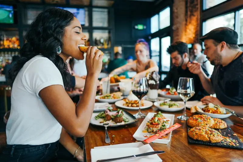
Al Fresco Evolution: How Restaurants Are Reimagining Outdoor Dining
Discover the rise of outdoor dining as restaurants redesign patios, rooftops, and pop‑ups, blending sustainability, tech, and hospitality to create unforgetta...Read More
Ghost Kitchens and the Delivery Revolution: Redefining How We Dine
Discover the rise of ghost kitchens, how they blend technology, sustainability, and storytelling to transform restaurant business models and deliver restaurantâ...Read More

The Instagram Effect: How Photo‑Ready Restaurants Win Over Diners
Explore the rise of Instagram‑ready dining, from photogenic plates to staff‑driven social sharing, and learn how visual storytelling fuels restaurant succes...Read More
0 Comments
Post Comment
You will need to Login or Register to comment on this post!